Newmag presented a new visual identity at the newmag / summerfest-2024 (video, photos)
06/27/2024
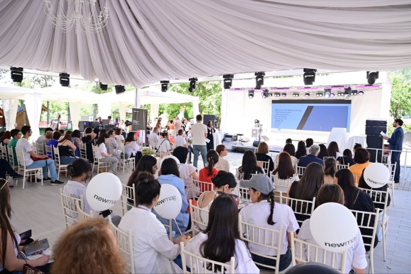
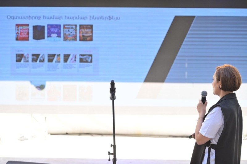
Newmag's new branding presentation took place at the Book and Art summer fest. The new visual identity was created by the Publishing House with the Indigo Branding.
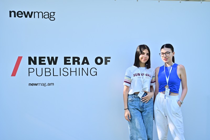
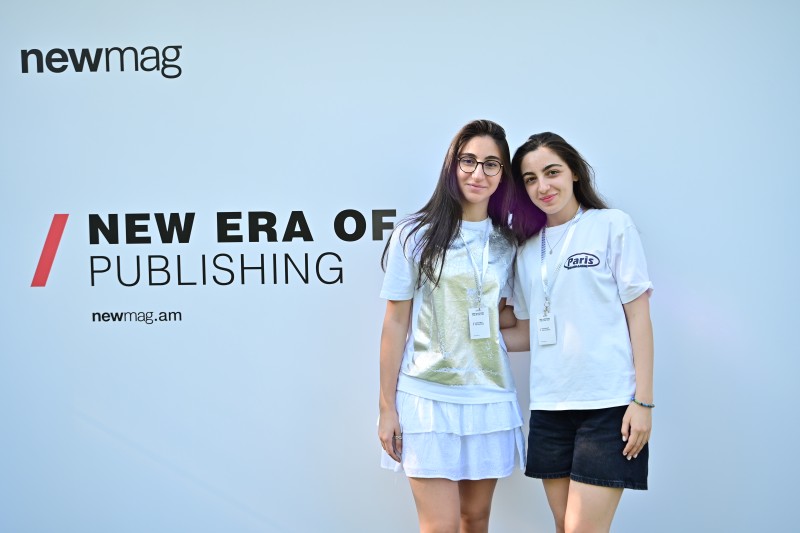
After a year of development, we have created a new passport of complete visual identity that will distinguish the Publishing House across books, events, social media, and packaging.


The Publishing House has launched a comprehensive and long-term branding initiative aimed at fostering emotional connections with readers, imbuing love as a symbol, and establishing a recognizable style akin to familiar handwriting.

According to Artak Aleksanyan, head of newmag, the goal of rebranding is for everyone not to see, but to distinguish.
"The work took about a year. The logo has also undergone subtle changes. The most important thing is that the entire philosophy of the Publishing House's identity has been built. We have tried to change, but change carefully and with care. We corrected it, matured it, but left the main thing, the emotion so that it would not be lost."
The Publishing House took this responsible path with Indigo Branding. The company held many meetings with the employees of the Publishing House, and as a result of consultations and close cooperation, the best solution was found. According to Eva Sargsyan, art director of Indigo Branding, while maintaining the base, they added what was missing.
"For the first time, the Publishing House in Armenia went through branding. Newmag is very serious about the branding process, and development, and most importantly, it takes into account the opinion of the readers. We introduced a simple but very interesting element: a slanted line. It very well emphasizes newmag's ideology of moving forward, the innovative approach to everything."


The Publishing House also has its new tricolor: black, white and a little red. You will often see those three colors in the visual product. In addition, the new breath will also be applied to the accessories presented by newmag: bag, envelope, and poster.
The Publishing House's online platform has also changed. The newmag.am website has been adapted to the new branding philosophy. Everything is simpler, with minimalist solutions and few colors, so that it is convenient and pleasant for the reader.

- Love from the first page
- Intimacy from the first moment
- Friendship for years.
These are the important messages that newmag will try to achieve thanks to the new visual identity philosophy. The reader may not notice the change but will feel it. More logical, literate, standing on firm feet. This branding is to package the mutual love with our readers, to be different, to recognize each other at once.
Share